Main Line Kitchen Design asks the question: “Do crazy kitchens have anything in common?”
I was looking for an unusual topic for this month’s blog, possibly with a humorous bent, and so I was inspired to try a Google image search for “crazy kitchens”. Not surprisingly there was no shortage of search results. The 5 photos of kitchens below were the oddest and most unusual.
Being a kitchen designer for going on 30 years, I suspected the results I would find would all share some common traits on top of just being wild looking. Namely:
- The kitchens would all be modern, contemporary, or eclectic in style.
- The kitchens would use strange and unconventional colors, I am not labeling them as tasteless, although some critics might.
- The kitchens would not be very functional or convenient to work in.
- Useful storage would be at a minimum.
- They would not obey NKBA (The National Kitchen and Bath Association) guidelines.
Each of the kitchens below do in fact have these characteristics in common.
How could I predict the offending kitchens would all share these traits? Because the inexperienced people who create the worst kitchens are most often architects and interior designers and these styles and lack of design considerations are common among those professions. As the saying goes “A little bit of knowledge is a dangerous thing.”
The worst design offenses for each kitchen are listed below each photo.

No storage areas for food. Improper venting of cooktop. Freezer door hits wall not allowing complete access. Faucet on side of sink ruins work zone. I suspect cabinetry is not being properly supported.

An eclectic mix of cabinetry and appliances that looks ridiculous. Little storage space for food, plates, and glassware. Drawers on back of island pull out under countertop overhang. Sink and cooktop are too close. Inadequate cooktop ventilation. Sink faces wall with window too high to see out of, and many more issues.

the sink faces wall with no good workspace on either side. Cabinet left of the sink will be ruined by water damage, Refrigerator door sweeps counter left of sink Freezer door hits cabinet. Window and curtains next to cooktop are a fire hazard. Lack of useful storage. Seating extends into work area. Just curious, why not put the sink in front of one of the windows?

Effective design for a live-alone octopus, however, for human beings, not so much. The biggest crime here is that the materials for this tiny kitchen exceed $40.000.00 Other issues include once again no venting for cooktop and most of the function issues listed in the previous kitchens.

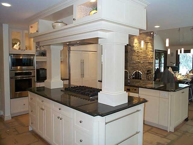
Why the posts? They are in the way and prevent a decent work area on either side of the cooktop. Refrigerator placement has door hitting counter and everyone going to the refrigerator interferes with the people at the sink and the cooktop. Storage issues, and like all the poor kitchen designs above, this would be a terrible kitchen to work in.

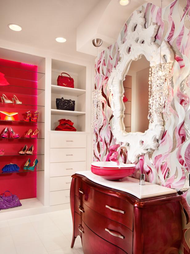
The bathroom above won Best Bathroom in the 2014 NKBA national competition.
Unfortunately, this demonstrates that kitchen designers and the professionals judging kitchen and bath competitions can be just as crazy as the designers for the kitchens we highlighted above.
At Main Line Kitchen Design, we try to do more than fulfill our customers’ dreams, we sometimes try to temper them. A dose of common sense can make the difference between something you might see in a design magazine but would never want your home to look like, and a kitchen you love that you would want to spend time in and enjoy every day.
Read our blog:
Is your kitchen designer going to kill you?
Hoping your kitchen designer has the strength and common sense not to design you anything like the designs above!
And of course…
Bon Appetit!
Paul
Main Line Kitchen Design

One Reply to “Crazy Kitchens, Do They All Have Something in Common?”
Crazy Construction Mistakes. -
[…] https://www.mainlinekitchendesign.com/general/crazy-kitchens-do-they-all-have-something-in-common/ […]